
 HOGWire – Golf Industry News
- ZERO FRICTION EARNS PRESTIGIOUS ING INDUSTRY HONOR AWARD FOR THE STRIDE GOLF BAG
- GolfTrainingAids.com Products Draw Huge Accolades at 2024 PGA Merchandise Show
- TRUE linkswear Names PGA TOUR Player Taylor Montgomery its Newest Brand Ambassador
- New Apparel Line from the Arnold Palmer Brand
- Edison Golf Launches New Website
Latest Golf Club Review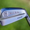
Miura Series 1957 Limited Edition Small Blade Irons
Latest Accessory Review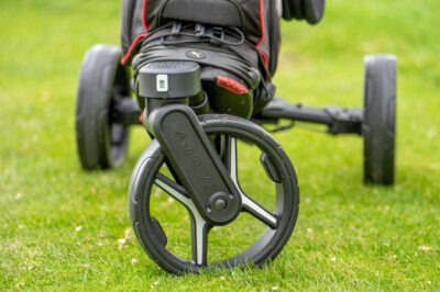
Axglo V3 Push Cart
Latest Course Review
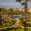
Pete Dye Course at French Lick Resort


HOG Interview


From a design standpoint, fixed width is more suitable, especially for growth purposes.
1024 x 768
What I think would be neat to see is dynamic drop down menu’s. For instance, you have a section labeled “In my Bag”, instead of having the text right below it in the gray box, just have the green header as a link. When the link is pressed, a dynamic menu appears below it listing what you have in your bag. They are easy to create, I can give you some great references if you need them. But this would save a lot of room on your site and give it a cool design look.
Nothing comes to mind as far as you missing something
My opinion, these are things that should be cleared of:
1) Whenever I make a comment, I get this result lable below where I am typing. Like right now it is showing 31 queries. 0.172 seconds, which…well, it’s unnecessary.
2) At the bottom of the left hand column is “Feeds:” What is this and is it necessary for the average joe to know that this page is validated as XHTML 1.0 transitional?
3) You have two comments in the upper right/left hand corners…they are funny, but they never change. If they are to remain constant, I don’t think you need them, otherwise, it would be cool if they changed every week or every other week.
4) You have a section on the left hand column that is for “Recent Posts” However, if you scroll down to this section, you are all ready at the end of posts listed under that section since you only list 5. There is only 1 main problem with that section, it’s the location. I say move that up near the top, so it’s more useful. Otherwise cut it as it’s not needed (5 posts only listed and viewing it now gets you to the end of those 5 post).
My final comment to you is this – if you go ahead and get sponsor links…please don’t have any pop-up banners/ads, etc.
skostiuk: Awesome reply. I love to hear something from someone else.
-I hadn’t thought of the menu idea but I may do some of that.
-The queries thing is part of wordpress. I can take it out or leave it. Funny thing is, how much extra time does it take to run the query?
-The comments yes! My pal MJ sent me a plugin which will rotate quotes in and out. When I implement that, I’ll go to one quote. Excellent.
-Recent posts has been moved up
-Feeds is also another built in function of wordpress. I can take it or leave it. You’re right, who cares if it’s validated?
-As far as sponsors go let me just say this. I hate spam. I hate popups. Any sponsor banners will be modest and tasteful, with NO popups or any crap like that.
Awesome. Keep the comments coming!
Also I had this idea. That image you had planted in the top center of your page, the golf ball with Hooked On Golf around it…I think that would be better as a link to your main index. Here’s why – if I enter in comments and submit them, in order for me to go back to the index site, I have to click on a very small link in the upper left hand corner that says blog home. I say leave that link, but also make that center image a quick link to your index page.
Done. Good idea!
Beautiful….great site by the way, I’m a huge fan!!!!
You are very kind.